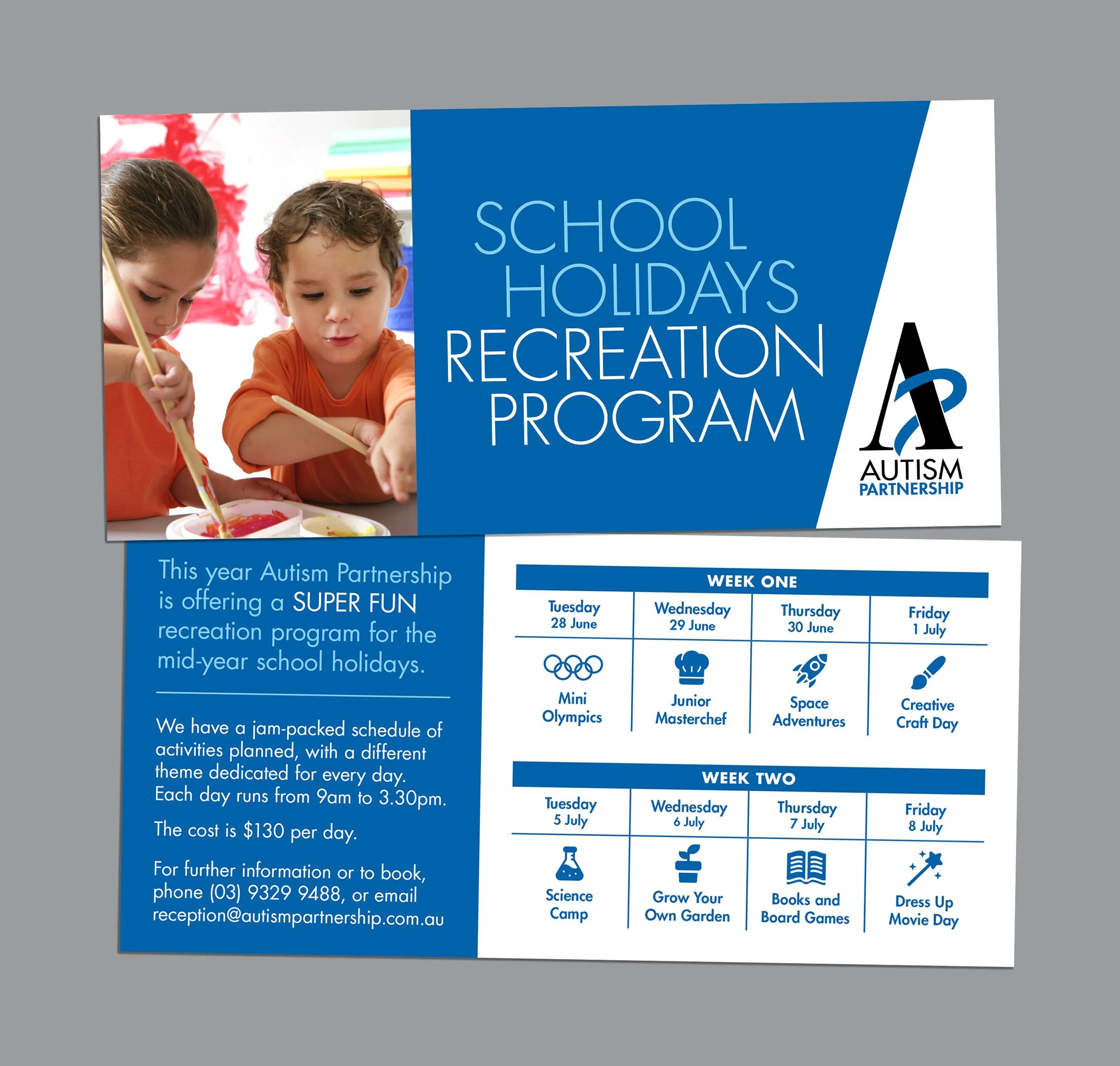
Autism Partnership
Digital | Print
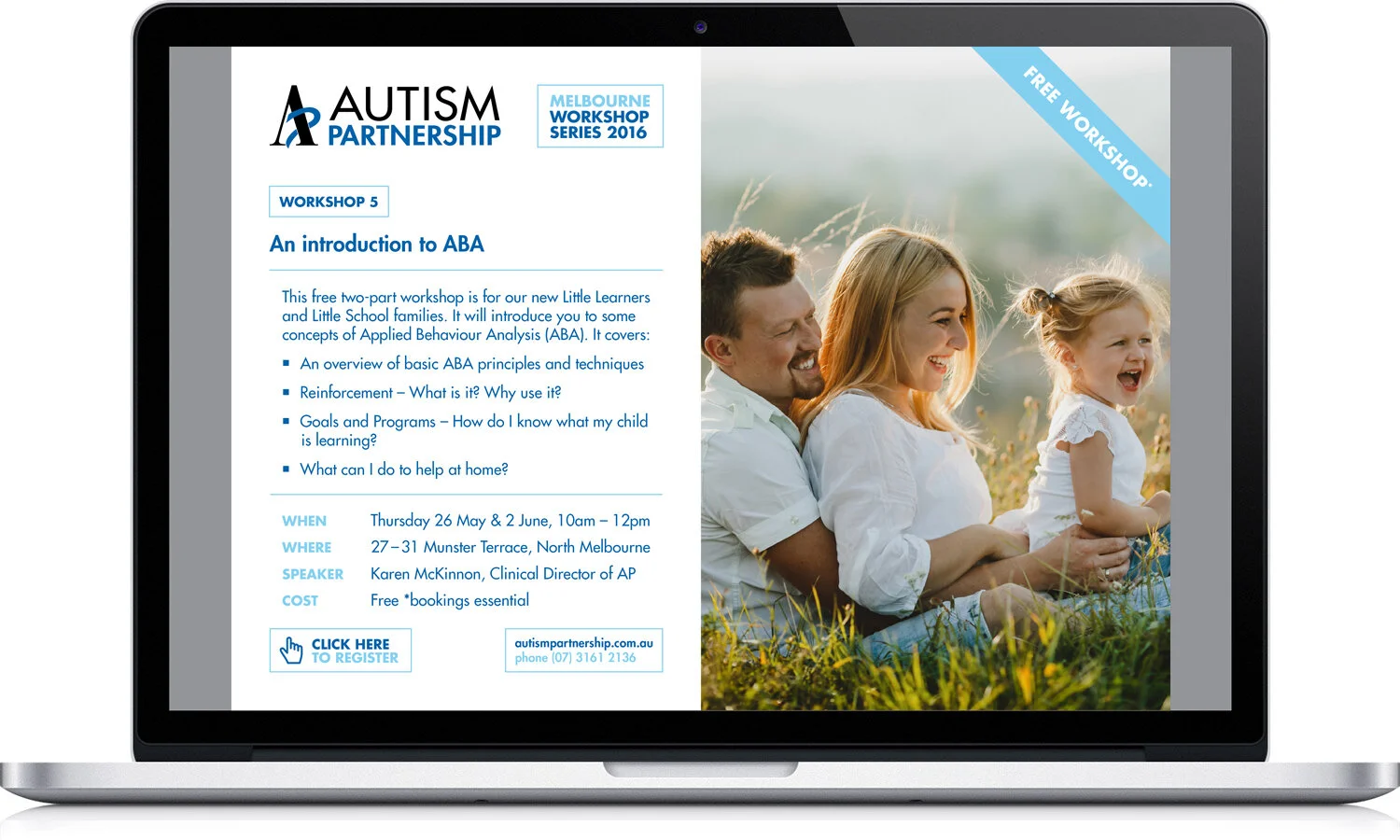
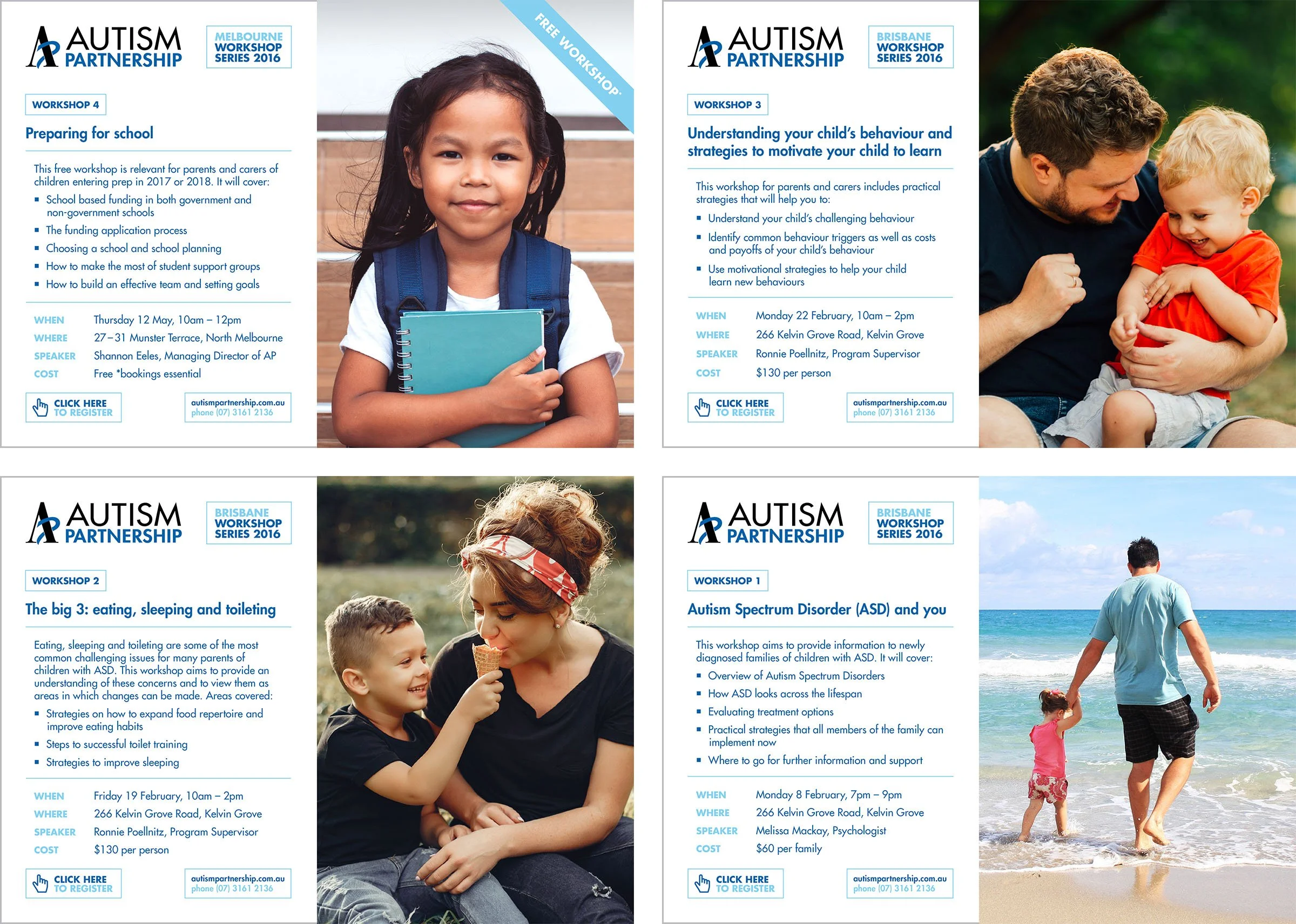
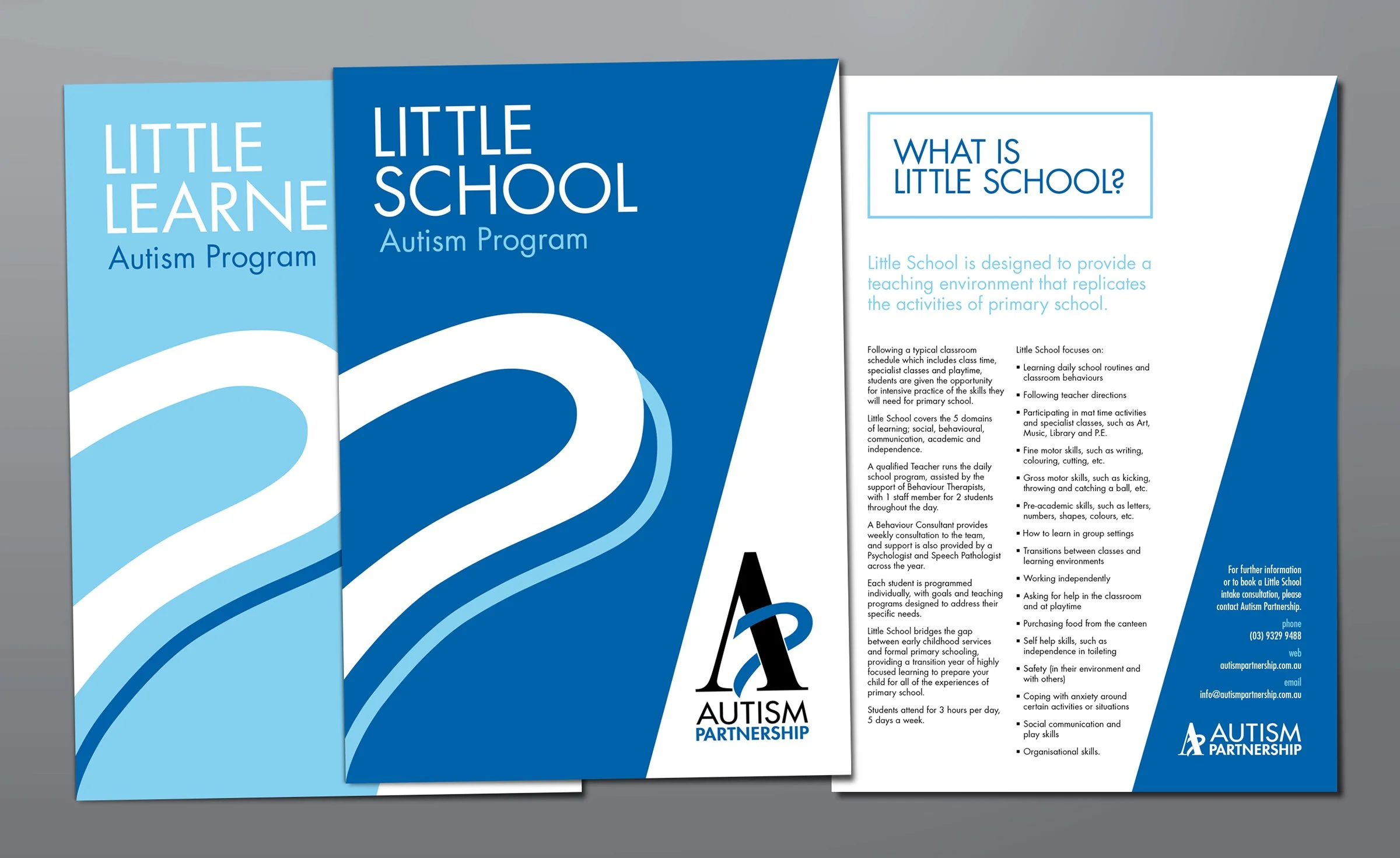
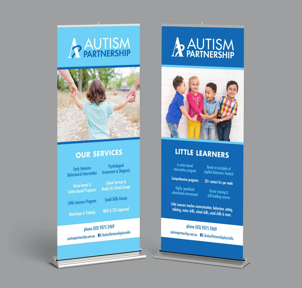
These pieces promote the services of a private practice for children with autism. The use of white and the introduction of a pale blue colour softens the overall look and feel of the collateral to evoke a sense of safety, kindness and understanding of a sensitive topic. Both shapes and angles are borrowed from the brand mark to create certain layouts, and the inclusion of warm photography capturing tender family moments can offer reassurance, possibility and hope.
eFlyers
Print flyers
Pull-up banners
DL flyer

